January 15, 2013 Tuesday 10: Batman Logos
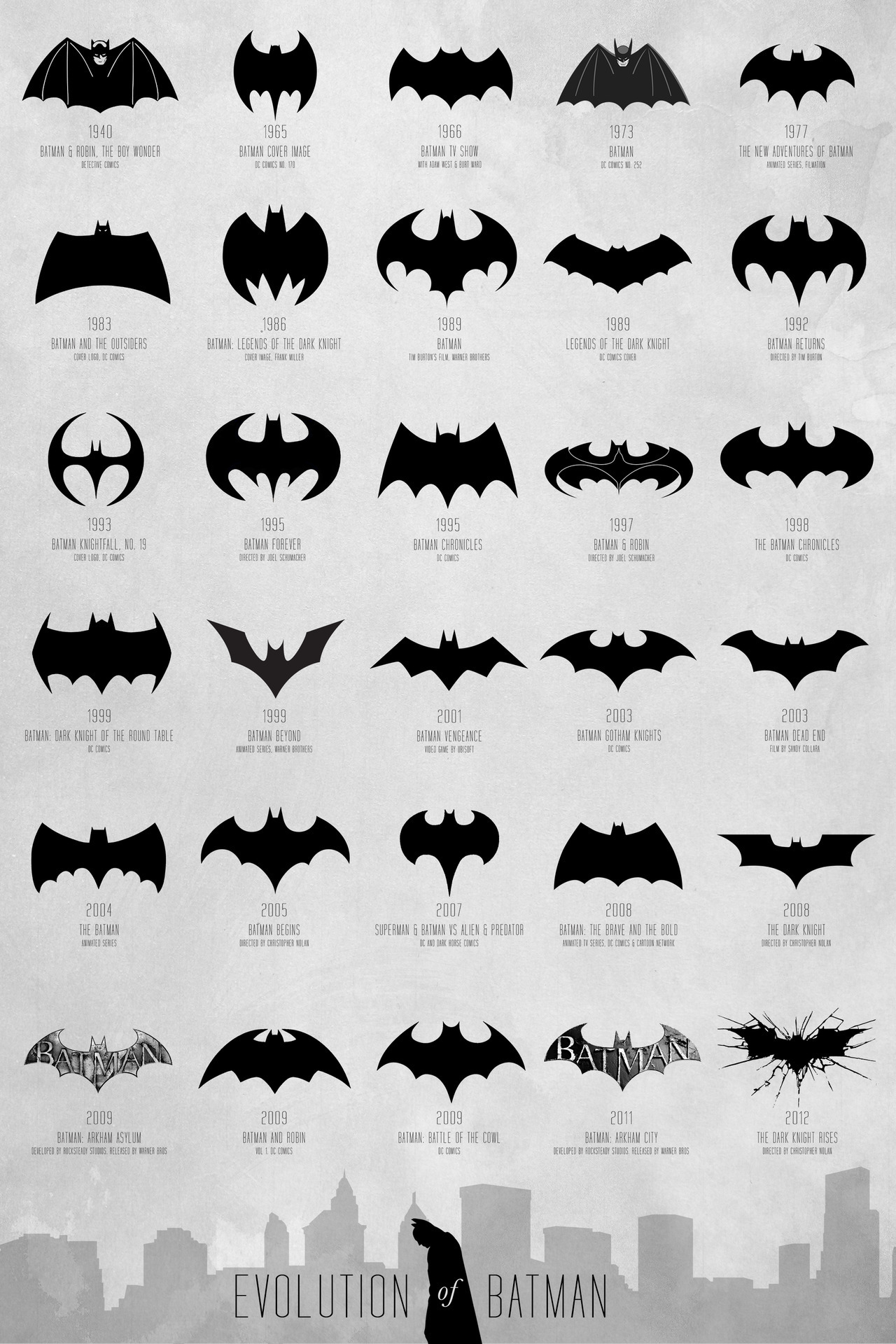
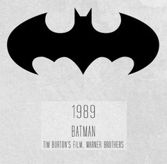
Batman Week continues with a look at my favorite Batlogos. I’ll have to be honest here, I hadn’t seen some of these before finding this reference sheet. To make things simpler, I’ve used that reference sheet as a basis, even though it is wrong wrong wrong about the logo for Tim Burton’s Batman, and that does make me wonder how many of the other ones are incorrect.
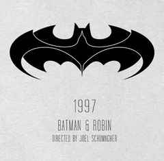
10. I know the movie is terrible, but I can’t help liking the integrated Robin symbol
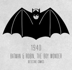
9. The one that started it off. Batman kind of looks like a vampire here.
8. I love how they perfectly updated it to look all future-y. It is a shame I haven’t seen more episodes of this show
7. This one looks like you could really do some damage with it if you threw it
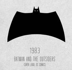
6. This is one I hadn’t seen before, but I love the severe Flying V look it has going on. Batman is a plane now: tremble, criminals!
5. I’ll admit that part of the reason I like this one so much is because I like the game so much.
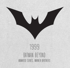
4. I haven’t seen this series, either, but have heard it’s delightfully nutty.
3. I’ve never even heard of this series, but I really like this simplified logo.
2. Honestly, this might be my actual favorite, but my #1 has major nostalgia points in its column. This one is just so perfect, though.
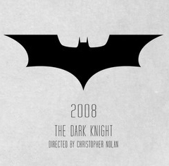
1. It had to be this one. This is the logo that started me on Batman, it’s the one I’ll draw if asked to draw a Batlogo, and it’s the one most people think of.
Written by: Mark
- 2 comments
- Posted under Art
Permalink # bd
said
bd
said
The full Outsiders logo with the words kind of ruins it. http://upload.wikimedia.org/wikipedia/en/7/7e/Batman-Outsiders-1.png
The best version ever is Chris Gardner’s capey logo
http://chrisgardner.carbonmade.com/projects/4330157
Permalink # Mark
said
Mark
said
I agree with you – the lettering does ruin that one :/
And that capey one is pretty sweet!